WebKitがSafari v10でサポートされるより広い色域のMedia Queryを解説&比較したサイトを公開しています。詳細は以下から。
AppleはiMac Retina Late 2015およびiPad Pro Early 2016モデル以降でsRGBより広い色域を表示できる”wide-gamut”ディスプレイを搭載していますが、WebKitは次期Safari v10およびそれらのディスプレイで利用できるMedia Queryを解説した記事を公開しています。
How WebKit is improving color on the Web! https://t.co/6X4Idvq0Kk pic.twitter.com/I7yffUA7g1
— WebKit (@webkit) 2016年7月1日
Let’s call the typical computer monitor, the type that you’ve been using for more than a decade, an sRGB display. Apple’s recent hardware, including the late-2015 Retina iMac and early-2016 iPad Pro, are able to show more colors than an sRGB display. Such displays are called wide-gamut (I’ll explain what sRGB and gamut are below).
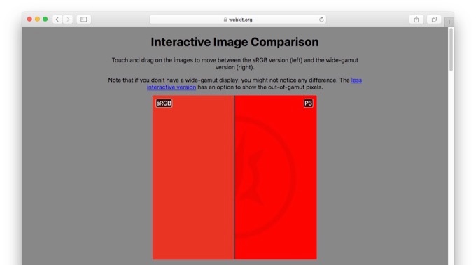
WebKitチームは、Retinaディスプレイの登場によりWeb開発者はhigh-DPIのページデザインを理解したが、次はP3などより広い色域を再現できるディスプレイを理解しなければならないとして新たにブログを公開し、その中でCSS Color Level 4でサポートされるcolor-gamut[1, 2]の解説、以下のデモサイトでsRGBとwide-gamutの画像の違いを比較することができます。
If you’re not using a wide-gamut display to view these images, the different versions might be quite similar, although color matching might produce a difference.
同様のサイトはiPad Pro 9.7インチ発売後にCraig Hockenberryさんら既に公開していますが、color-gamutについての解説などが気になる方はWebKitブログをチェックしてみてください。*sRGBとP3の違いを比較するにはそれらをサポートしたディスプレイおよびブラウザが必要です。
- Improving Color on the Web – WebKit

コメント
MBP Retinaではわからないな・・・当たり前か。