Appleが「iPhone X」向けWebサイトのデザイン方法をWeb開発者に公開しています。詳細は以下から。
AppleおよびWebKit開発チームは現地時間2017年09月22日、日本時間2017年11月03日から発売が開始されるEdge-to-Edgeディスプレイを搭載した「iPhone X」向けのWebサイトをデザインするためのポイントをまとめた記事をWebKit公式ブログで公開しています。
Learn how to ensure your website looks great on iPhone X. https://t.co/69GMnpW6vy pic.twitter.com/uFWjy6awpV
— WebKit (@webkit) 2017年9月22日
Sep 22, 2017 by Timothy Horton
Out of the box, Safari displays your existing websites beautifully on the edge-to-edge display of the new iPhone X. Content is automatically inset within the display’s safe area so it is not obscured by the rounded corners, or the device’s sensor housing.Designing Websites for iPhone X – WebKit
AppleがiPhone Xの発表と同時に公開した”Human Interface Guidelines“や”Designing for iPhone X“によると、iPhone Xには新たにタッチイベントを認める「Safe Area」という概念が導入され、通常のWebサイトデザイはこの「SafeArea」に収まるそうですが、
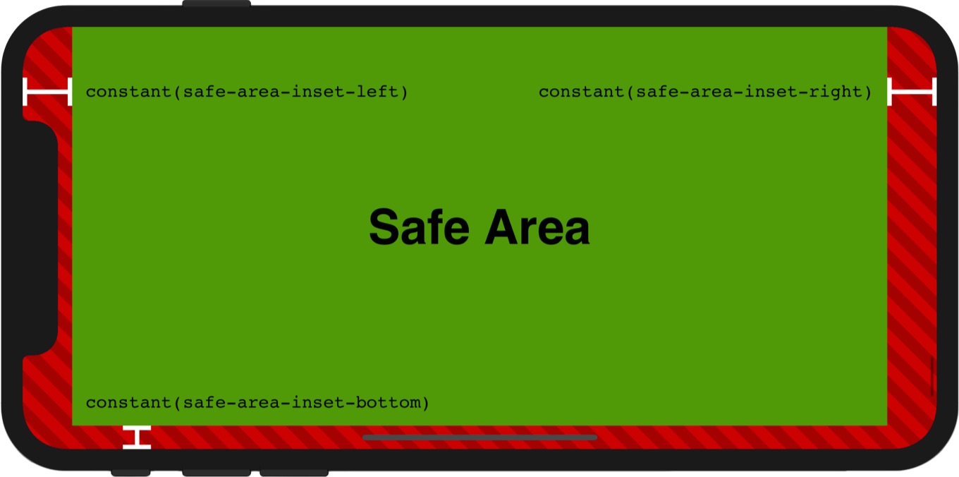
For iOS 11, a new layout guide was added to auto-layout called a Safe Area layout guide.[…]On iPhone X, the Safe Area layout guide provides an additional benefit. It’s inset from the top and bottom of the screen edges in portrait orientation, even when no bars are visible on screen.
Designing for iPhone X – Fall 2017 – Videos – Apple Developer
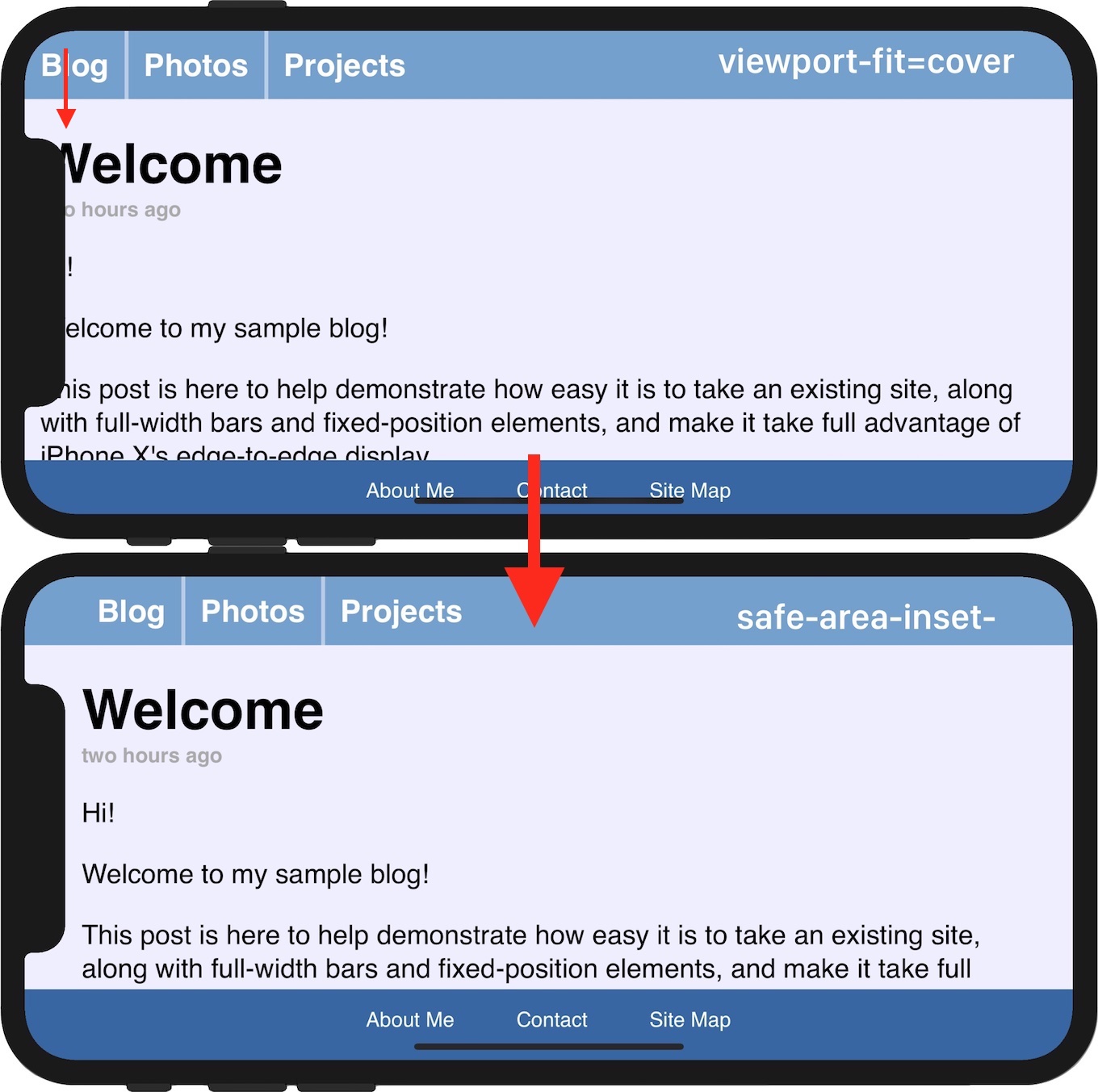
公開されたブログではiPhone Xのスクリーン全体を利用するためにViewportに新たに追加された”viewport-fit“および”viewport-fit=cover”によりセンサーハウジングなどと被ってしまうコンテンツなどを「Safe Area」に戻すための値を参照できる”safe-area-inset-“の説明などがされているので、Web開発者の方はチェックしてみて下さい。
- Designing Websites for iPhone X – WebKit
コメント
面倒くさいよぅ。Xはあくまでも記念モデルってことで早々にディスコンにして欲しい。