
AppleがMac App Storeのデザインを刷新しています。詳細は以下から。
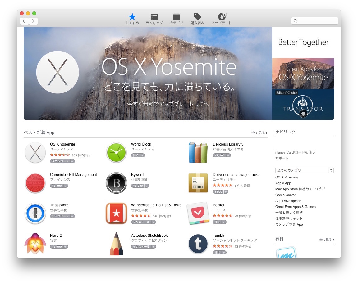
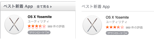
AppleがiTunes Storeに続き、Mac App Storeのデザインも変更したようです。旧デザインと比較すると以下のようになっており、フォントも細く(Light)なり、カラーは白で統一されているものの、
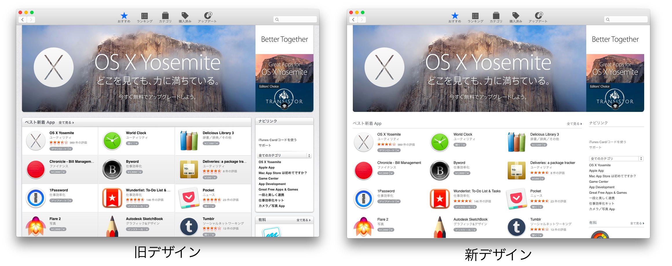
購入ボタンやアップデートボタンなど一部のエレメントはまだ古いままのようで、iTunes Storeのアップデート時同様これから細かいCSSに手が加えられていくようです。
The updated design is currently showing up every few minutes on the throughout the store, though it still shows the old design on many pages just as much as the new. The iTunes Store had a similar issue when it was updated last month, and once the rollout is complete the new design will be available to everyone. A few elements such as the “Update” button are also still using the old style.
関連リンク:
・Apple debuts Mac App Store makeover with Yosemite-style interface – 9to5Mac
・Apple、OS X YosemiteのMac App Storeメニューバーアイコンをマイナーアップデート

2014年11月07日 03時40分:誤字修正しました、失礼いたしました。

コメント
Storeのでデ
タイトルくらいちゃんと校正しましょうよ
誤字脱字多すぎ