
tvOSに採用される新しいアイコンは視差(Parallax)効果を出すために2~5レイヤーを利用するようです。詳細は以下から。
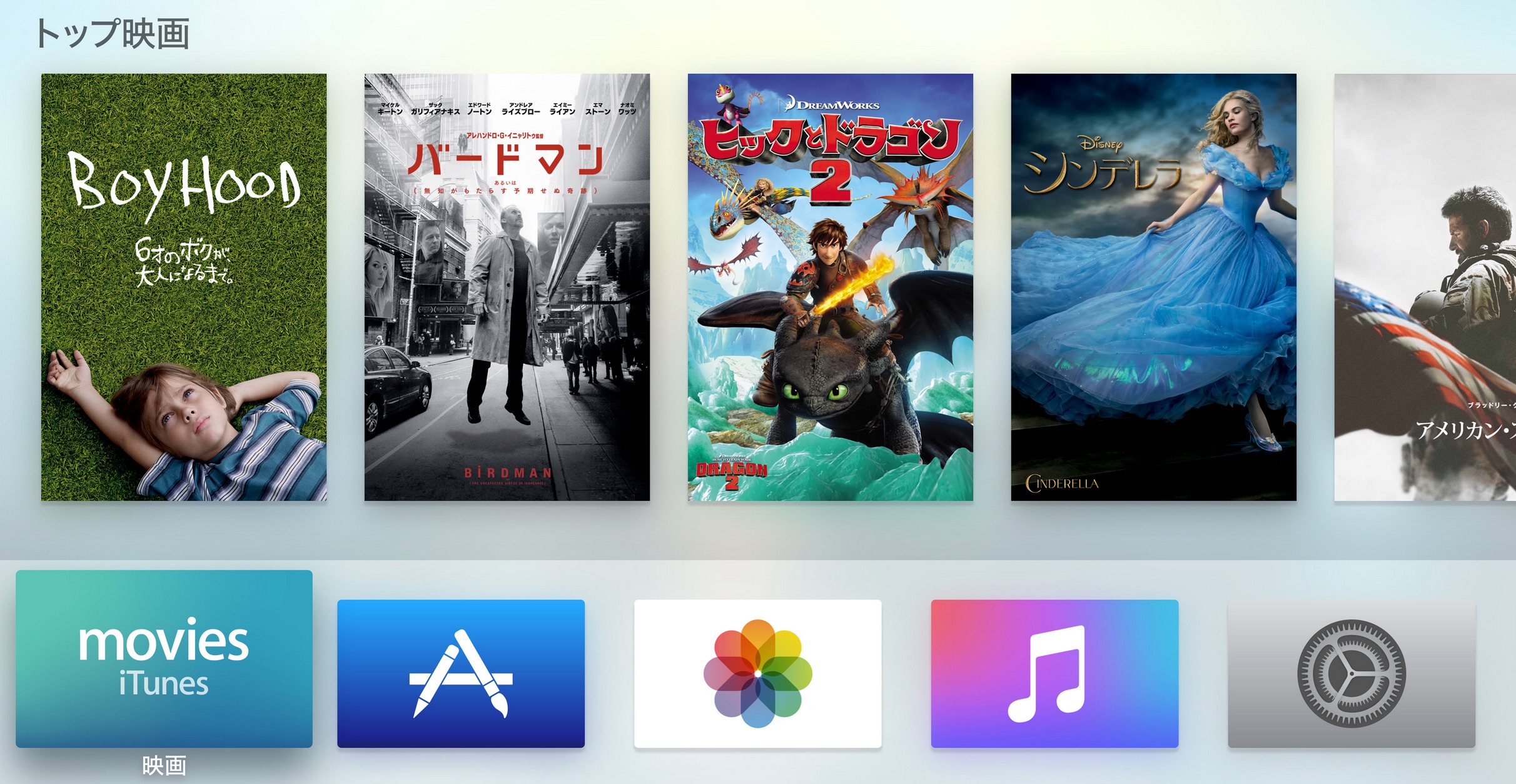
Appleは本日行われたスペシャル・イベントで新しいOS”tvOS”を発表し、既に複数の開発者にSDKやドキュメント公開していますが、MacStoriesによるとtvOSでは新たに視差効果”Parallax Effect”を利用したアイコンを作成するように定められており、Parallax Previewer という専用のプレビューアプリも公開されているそうです。
Interesting Apple TV Tidbits: App Size Limits, Parallax Icons & More http://t.co/3wH2Qsmyaw

The Apple TV requires layered icons so that when a user hovers over an app, there is a nice subtle parallax effect that occurs. Developers can actually download a Parallax Previewer app for their Mac to test out their app designs and see how it will look on the new Apple TV. I had a go myself, and quickly created a MacStories Apple TV icon, which you can see in the YouTube video below.
[Interesting Apple TV Tidbits: App Size Limits, Parallax Icons & More – MacStories]
既にiOSの壁紙でも採用されている視差効果を出すためには2~5レイヤーで構成されたアイコンを作成する必要があり、MacStories の Grahamさんは3レイヤーで構成れたアイコンのデモ動画を公開しています。(Apple TV Human Interface Guidelinesにある環境設定アプリのアイコンも参考にどうぞ)
Important: Layered images are required for app icons. For guidance, see Layered Images.
App icons must have between two and five layers to create a sense of depth and vitality as your icon comes into focus.
[Icons and Images – Apple TV Human Interface Guidelines – Apple Developer]
Apple TV Human Interface Guidelinesは一般に公開されているので、興味がある方は関連リンクからAppleのサイトへどうぞ。
関連リンク:
コメント