UX Launchpadが掲載したGoogleとAppleがiPhone用に設計したMapアプリのUX分析 “Design Explosions Issue #1: Mapping on iOS”という記事が話題になっています。詳細は以下から。

この記事はIntroとSummaryで「我々がMapアプリの勝者を決めていると思ってこの記事を読んでいるなら失望するでしょう」「ここに勝者はいない、2つの同様のアプリを研究することに刺激を受けるデザインの授業だ」と、GoogleとAppleのMapアプリの優劣を付けるわけではないと強調しています。
In issue #1 of Design Explosions, we dive 10k words deep on Google Maps and Apple Maps to see what we can learn: https://t.co/ECHVgHyRIS

Intro:If you’re reading this to see a head-to-head comparison where we crown a winner, you’re going to be disappointed.
Summary:There’s no winner this time, just a bunch of design lessons inspired from studying two similar products.
§11まであるので全て抄訳しませんが、両MapアプリのUXの違いが大きく現れているのが「ルート」機能で、両アプリをシルエット化するとAppleのMapアプリのルート画面はステータスバーが隠され最適化されているように見えますが、アフォーダンスの数を数えてみるとGoogleのMapは7つあるのに対しAppleのMapは1つになります。
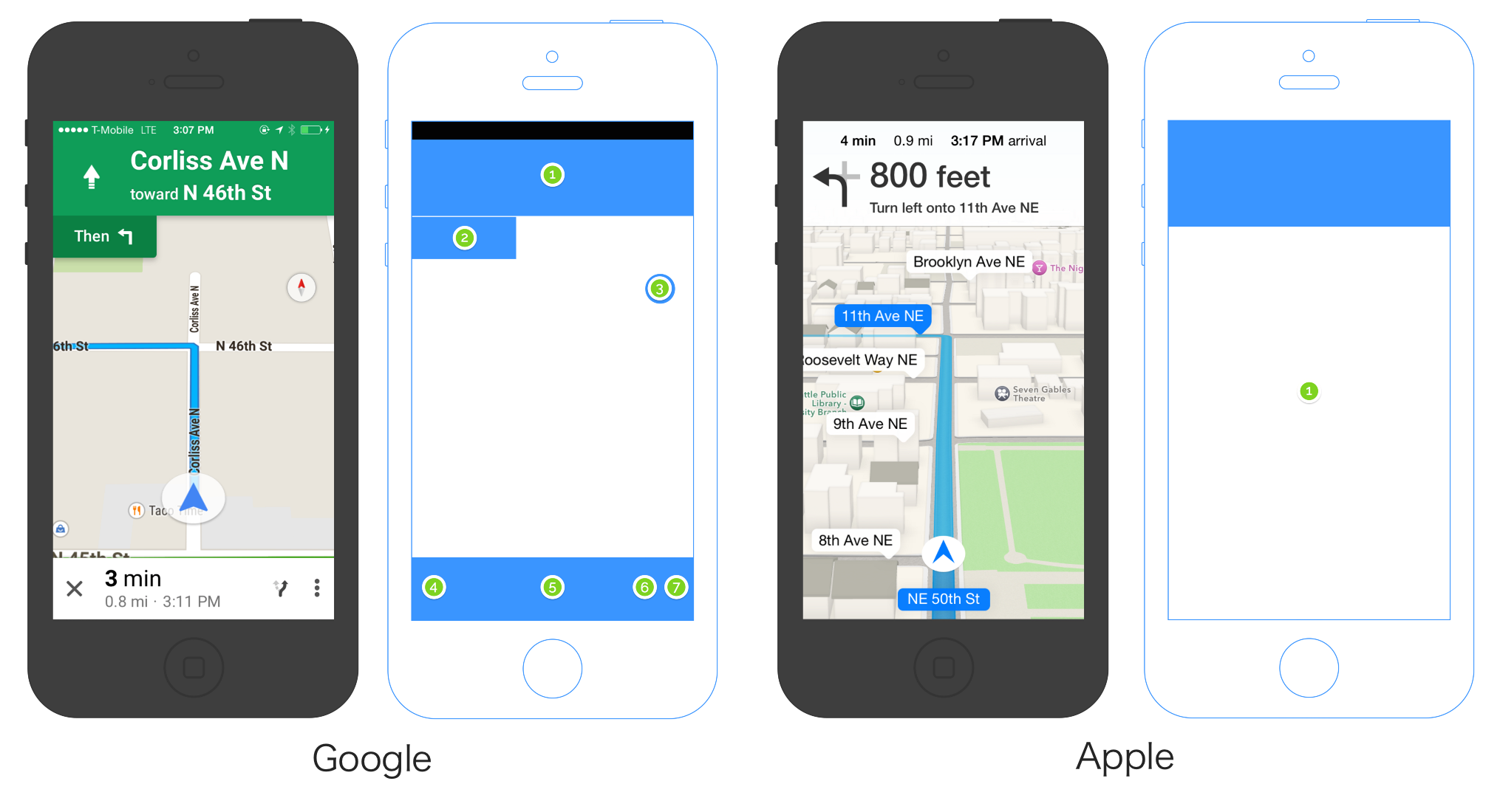
Clearly Apple is optimizing its real estate here. All right angles, no OS bar across the top for cell reception, wifi, time, battery, etc. But how much can Apple really fit into such a small amount of chrome? Let’s count the number of affordances in each. Google on left, Apple on right:
AppleのMapアプリは1タップすることでアフォーダンスが5つになりますが、GoogleのMapアプリはその1タップでルート案内をキャンセルしたり、1タップで交通渋滞をONにしたり様々なことが出来ます。
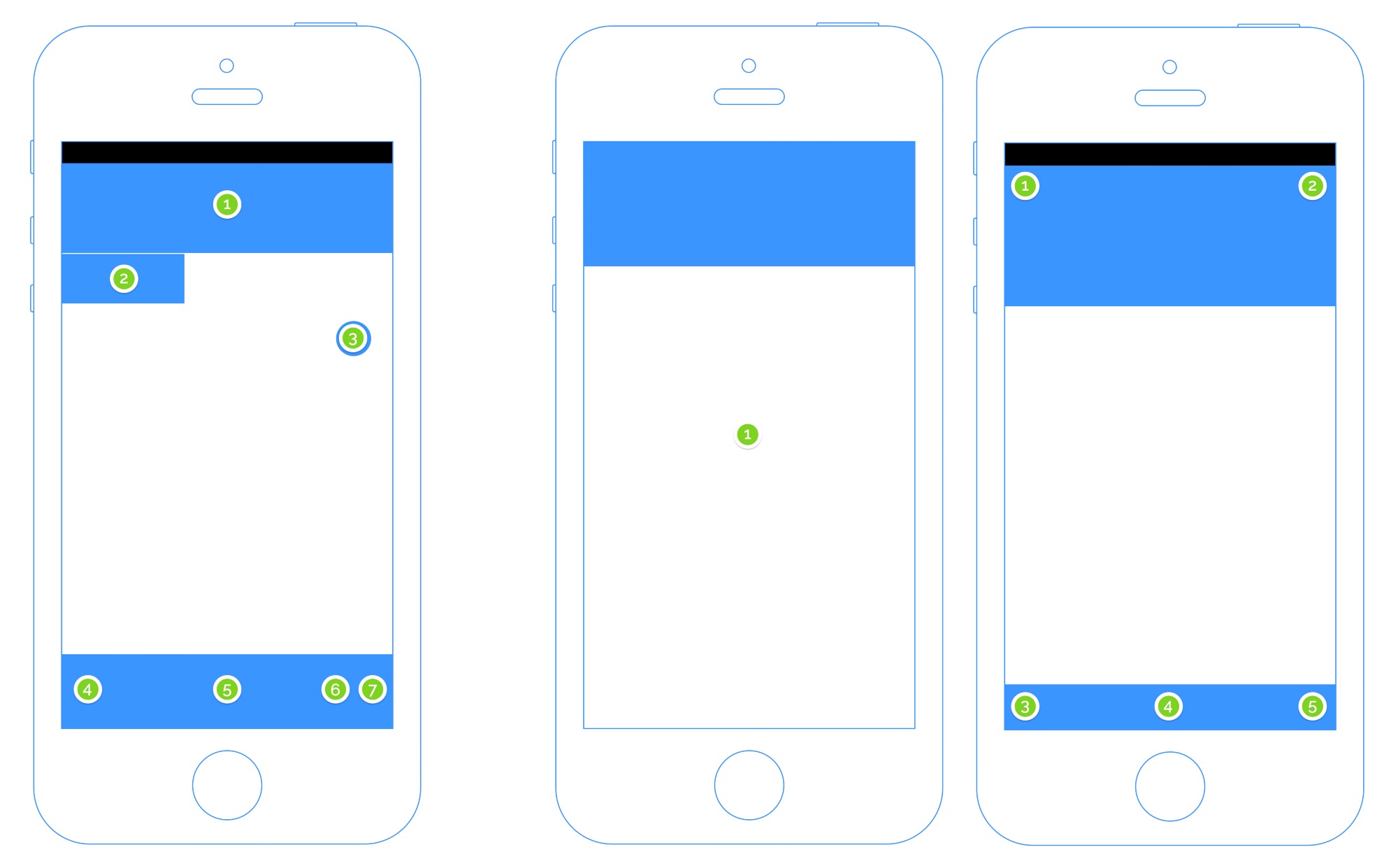
In Apple Maps, no matter where you tap on the screen, the same thing happens. It’s one giant tappable target. Whereas Google Maps has a more traditional design that features seven different touch targets.
I love this comparison. Google is optimizing for driving because everything is one tap away. Want to cancel the trip because you’re looking for parking? One tap. Want to figure out how to turn on the traffic map? One tap. Want to re-orient the map to the direction you’re facing? One tap. It’s a very flat system where everything is right there, even things like seeing what time it is our checking to make sure your battery is ok.
一方、多くのボタン(選択肢)を画面に出しているGoogle Mapは「選択肢が増えるほど意思決定に時間がかかる」というHickの法則に直面します。
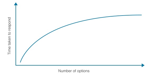
[Hick’s Law Applied to Application Design]
On the other hand, Google Maps is running up against Hick’s Law which can be summed up as “options slow people down”. Sure, the available options are all a single tap away. But there are a lot of them.
It’s a wonderful example of tradeoffs. They’re both right. You can prefer one, you can argue why one is worse, but I’d prefer that you simply admire two solid answers to a very complex design problem.
「これはトレードオフの素晴らしい例で、どちらのデザインも正しい」とUX Launchpadは強調しており、この他にも検索フィールドやThumb Zone(右手の親指が届く範囲)とボタンの配置などについても議論しているので興味のある方は関連リンクからどうぞ。
関連リンク:
・Design Explosions: Mapping on iOS — Design Explosions — Medium– UX Launchpad


コメント
この「ステータスバーを隠すのは良いことだ」みたいな風潮はなんなのかね
公式で推奨してるらしいけど
マップアプリを開きながら、時刻を確認したいし、電波状況だって気になるのに、なぜ隠すのか
車での利用を考えてるから、
時計とか余計なものはいらない
ヒックの法則は
T=a+b*log2(b+1)だからちょっと計算してみると面白いね。
ttps://www.sociomedia.co.jp/259
連続する動作ではTは単純な和となるはずだから
Googleのルート画面は
T=a+b*log2(7+1)=a+3b
Appleのルート画面はGoogleと同じOptionを出すまでに
T=a+b*log2(1+1) + a’+b*log2(5+1) ~ a+b+a’+2.6b = a+a’+3.6b
一見Appleの方がa’+0.6b所要時間がかかると思うけど1度画面を見るという動作がaに含まれている分a’は小さくなるから0.6bちょっと長くなるだけで済むのかな?
後、個人的にはReferenceにあるAppleが非推奨にしているHamburgers UXの話が興味深い。
ttps://medium.com/design-philosophies/apple-and-hamburgers-a17e4099fada
>車での利用を考えてるから、
>時計とか余計なものはいらない
ユーザーが設定で選択できるようになれば良いと思うんだがな。
車の時計とかすぐ狂うから使えないし。
iOSもAndroidもユーザーが自由にフルスクリーンモードを切り替えできたら良いのにな…
「すべてを抄訳」て……